AN UPDATED LOOK FOR PJM

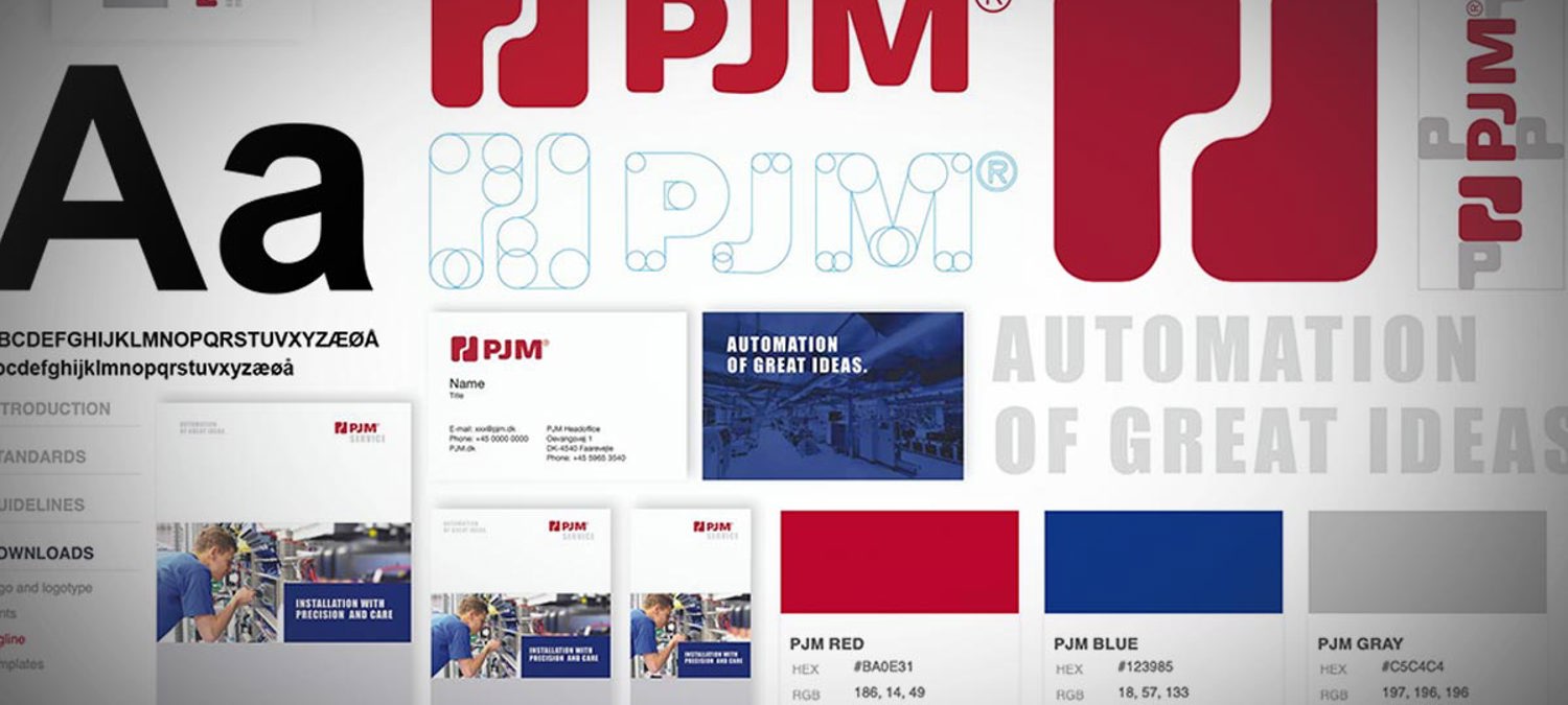
We have updated our logo and our visual presence. Here it is.
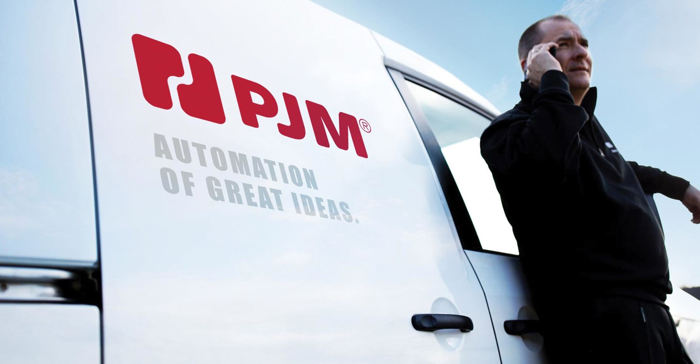
In this blog post: An updated company name and an updated logo – small, but essential changes in the way we present ourselves to the world around us. We also changed our tagline to Automation of Great Ideas, because that’s what we are all about.
AN UPDATED COMPANY NAME
Our legacy is clear, and we are proud of it: We were founded as Poul Johansen Maskiner in 1960, and that has been our name ever since. But we also realize that we are operating in a global marketplace where few people are familiar with Danish pronunciation – and we have already been referring to ourselves as just PJM for years.
So, we have now decided to present ourselves as PJM in the future, and with the release of our new website, the updated name is fully implemented. We have even made PJM a registered trademark.

AUTOMATION OF GREAT IDEAS
That’s us. We take the ideas that our customers develop, and we improve and automate them. In doing so we help make industrial processes faster, more efficient, more precise, and more independent of repetitive human labour. We work closely with our customers from the early stages of a project, adding value as we go. Our payoff – or brand promise, if you will – reflects this.
LOGO WITH A TWIST
Our logo has been with us since the early days and represents the initials of our founder, Mr. Poul Johansen. The P-J constellation works well for us and reminds us of where we come from.
And you may not be able to tell the difference between the old logo and the new one – but there is in fact a slight modernization in there: We have changed the rounded corners on the logo and have moved the two letters slightly apart, making the logo square in shape.
NEW COLOUR SCHEME
On this website and our printed materials, you will also notice that we have chosen a new colour scheme for our company. PJM has been employing a red colour scheme for decades. Therefore, the red colour represents tradition and history. The new blue colour represents quality, and the grey colour represents stability.
We hope you will appreciate the new design.
